
With the number of published books exploding, it’s harder than ever for yours to find an audience.
A professional cover is key to help your book stand out in the crowd. Your cover is an ad for your book. Ideally, it entices readers to click on it or pick it up and read the blurb. A quality cover also shows you take your work seriously. If the cover’s well done, it’s an indication the content within may also be of good quality.
Whether you’re a graphics pro designing your own covers or an author thinking of hiring a designer, here are a few guidelines to keep in mind.
1) Less is more.
You can’t (nor should you try to) depict your entire work on the cover. Rather than recreating pivotal scenes or including every character, your cover should show a slice of the book—present a central image that hints at the contents. Your cover doesn’t need to represent the entire plot arc; it should represent the idea of your book.
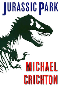
Chip Kidd’s cover design for Michael Crichton’s Jurassic Park is an example of a clean, iconic look that clearly communicates the content without clutter.
2) What does your cover tell readers about your book?
This is where genre conventions come in. The imagery, colors, textures, and type work together to deliver cues to potential readers. You want to make sure they're delivering the right message.
Would you pick up Laura Landon’s The Most to Lose expecting to read a hard-boiled detective thriller? No, and if the book did turn out to feature more gun fights and seedy pool halls than romance, you’d probably feel misled.
The muted color palette, the purple, the model’s dress, and the swishy font all work together to tell readers it’s a historical romance.

If your book is science fiction, you want your cover to “say” science fiction. If it doesn’t, you’re missing out on a chunk of potential readers who are searching specifically for sci-fi. Conversely, if your cover reads as science fiction but your book is actually a romantic comedy, you also have a problem. Not only are you missing out on potential readers, but you run the risk of alienating those who pick up your book expecting a good sci-fi read.
3) Type matters.
Font choices are an important part of communicating genre. The swishy font on the Landon cover signals romance—a thick, blocky font wouldn’t send the same message. On a thriller you expect to see condensed sans serifs like Knockout and Trade Gothic. On westerns, thick slab serifs and rugged historic fonts convey the genre. Romance novels call for flowing scripts and lighter, more elegant typefaces.
The arrangement of the type is also important. Don’t just slap the title in a text box, apply the font, and call it a day. The title and author name should be carefully placed, sized, and kerned so the text interacts with the imagery to create a cohesive message.
4) Don’t lean too heavily on stock photos.
Unless you’re commissioning a custom illustration, chances are your cover is going to include some stock images. If you want your cover to be unique, it’s important that you don’t rely on a single stock image to carry the design. If an image is strong enough to singlehandedly create a powerful cover, it’s probably already been used on countless other covers, billboards, websites, calendars, greeting cards, and magazine ads for allergy medications.
This is not to say you shouldn’t use stock images. Just find ways to make them your own. Flip them, combine them, deconstruct them, bend them, break them, tint them, replace heads, transplant faces—the possibilities are unlimited.
5) Your cover should stand out as a thumbnail.
If you’re publishing an e-book, readers will likely see it first as a tiny rectangle. Zoom out until the cover is about the size it will be online. Can you read the title? The author name? Does the image stand out and grab your attention? If you don’t have enough contrast on your cover, the type and imagery will blend together, creating an indistinct effect in comparison to the bold colors and large type of the cover next to yours. Which one are readers going to click?
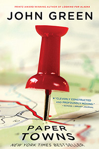
John Green’s Paper Towns shows how an image can be arresting, making you want to know more. Even though the title and author name aren’t huge, they are clearly readable even when the cover is at a small size.
6) …but it should also hold up at a larger size.

So much emphasis is put on the importance of standing out as a thumbnail, that it’s easy to overlook the importance of your cover looking good at a larger size. Ideally, a closer look at your full-size cover should reveal previously unnoticed subtleties. This is especially important if you have a print version of your book, but it's also key for e-books. When readers open up the “look-inside” feature, does the quality of your cover hold up? Is it as intriguing as when it first caught readers’ eyes as a thumbnail?
When you see the cover of Ania Ahlborn’s The Bird Eater, the avian skull on a fork and the bold title work together to grab your attention. When you enlarge the cover, you see that the little gray blobs, barely distinguishable at thumbnail size, are actually feathers, adding to the cover’s creepy effect. The gritty texture of the fork also becomes apparent at a larger size.
—
Of course, an amazing cover can’t make up for a subpar book. You need to deliver on the promise a good cover makes with a strong blurb, an intriguing plot, and a well-written story. But keep in mind, your cover alone can make readers want to try your book.