

I almost spit out my coffee Monday morning when I found out my design for Cargo by Michael Berrier had won the fiction category in the January edition of Joel Friedlander’s e-book cover design awards.
Joel had this to say about the cover design: “We’re instantly aware of the drama and tension of the story. A very self-assured design that does a superb job of communicating with readers.”
Thanks, Joel. I appreciate the feedback, and I’m honored to win. This month’s contest had some amazing covers, including a trio of retro throwbacks for the Munch Mancini series designed by Kit Foster and a slick concept for Surfing the Seconds.
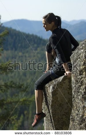
I put a lot of work into designing Cargo, but it wasn’t a solo effort. Before I even fired up Photoshop, the author had already put a great amount of energy into communicating his ideas. In addition to providing detailed information about his book (plot, characters, themes, etc.) as well as an excerpt, he also described the tone he was hoping for and provided links to other covers he liked. He even sent along video clips. One showed freestyle climbing—not the style in Cargo but with the same elements of danger—and the other showed the type of rugged mountaineering (think lots of snow, ice, and dark crevasses) that the characters in Cargo endure.
Keeping all this in mind, I went to work.
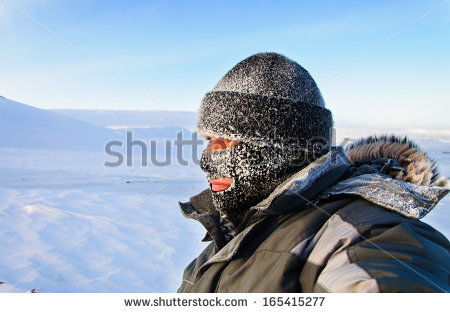
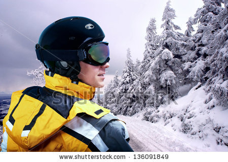
I wanted a design that featured the main character without showing too much of her face. I usually try to steer away from faces, as they can get in the way of readers forming their own mental picture of the characters. But you can avoid this if you find a way to obscure the features. In this case, ski goggles and a hat seemed appropriate. After hours of searching stock photos for images of a female mountaineer in heavy-duty climbing gear, I was coming up empty-handed. There were plenty of photos of women climbers, but they didn’t convey the grit of the main character in Cargo.
This was actually a good thing because it’s risky to simply pick a stock image and call it a day. Not only does that usually make an ineffective design, but the better the photo, the more likely it is other cover designers have used it. If you spend enough time browsing e-books, especially in a specific genre, you will start seeing the same models—and even the same exact images—cropping up on book after book. So I found several stock images that I could combine into something new.
The book is set mostly on the dangerous slopes of the Andes, so a picture of the mountains was an easy choice. I layered a public domain topographic map of the Andes on the blue ripped paper bar behind the title. To add to the feeling of danger and despair, I gave the author’s name a black ice effect. Finally, to blend the cover together and give it a unified feel, I layered some images of snowstorms and threw in a bokeh effect. After the author approved the front cover, it was simple enough to wrap the design around to the spine and the back.

Overall, I was happy with the final cover. At thumbnail size, the image stands out enough to entice potential readers to click for a closer look. Enlarged, the cover contains enough subtle details to add visual interest and hint at the story inside.
I have Berrier to thank for providing such detailed information about his book to start with. Book cover design is a collaborative process, and the more authors share about their vision for their book, the easier it is to arrive at the right cover.